









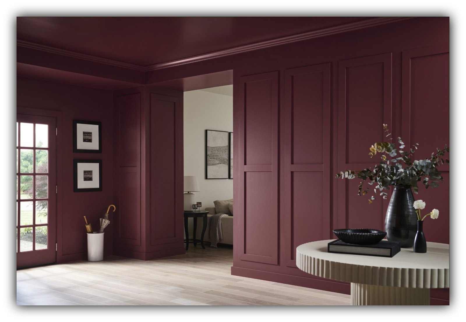
Color Drenching Isn’t New. It Just Got a Better Publicist.
Turns out your grandparents were doing it decades before Instagram gave it a hashtag.
By Gina Hill | Alaska Headline Living | July 14, 2026
If you’ve spent more than five minutes scrolling through home décor on Instagram, Pinterest, or TikTok lately, you’ve undoubtedly been introduced to the latest “must-do” design trend: color drenching.
The name sounds dramatic. The photos are undeniably gorgeous. And according to seemingly every interior designer and influencer on social media, it’s the secret to making your home feel luxurious, cozy, sophisticated, and magazine-worthy.
Except, it’s not new.
Not even close.
So, What Is Color Drenching?
Color drenching simply means painting nearly every architectural surface in a room the same color.
That includes:
- Walls
- Ceiling
- Trim
- Doors
- Built-ins
- Sometimes even shelving, radiators, and furniture
Instead of crisp white trim breaking up the room, everything is wrapped in one continuous color, creating an immersive, cocoon-like effect. Designers often use different paint sheens rather than different colors to add subtle dimension.
It’s a beautiful technique. It just isn’t revolutionary.
Your Grandmother Probably Did It First
The design industry has a habit of renaming old ideas and presenting them as fresh discoveries.
Color drenching is a perfect example.
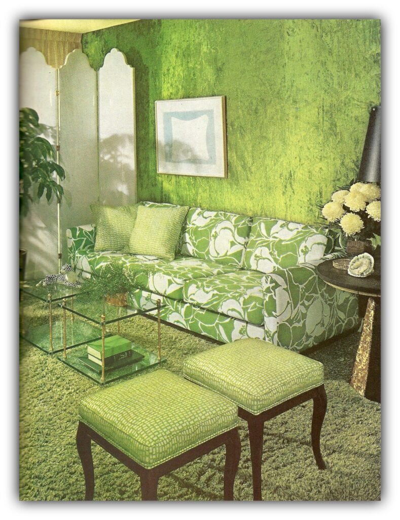
Victorian homes frequently featured walls, ceilings, and elaborate millwork painted in coordinated, saturated colors. The Arts & Crafts movement embraced richly enveloping rooms long before social media existed. Even homes from the 1960s, ’70s, and ’80s often committed fully to a single color palette, whether it was avocado green, harvest gold, burgundy, or dusty mauve.
Back then, nobody called it “color drenching.”
They just painted the room.
Why It’s Suddenly Everywhere
The answer has less to do with design than with digital marketing.
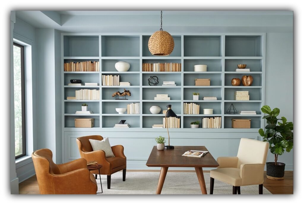
A monochromatic room photographs exceptionally well.
Without contrasting trim or visual interruptions, architecture becomes more sculptural. Furniture pops. Shadows look richer. Every image feels curated.
In other words, it performs beautifully on social media.
The catchy name didn’t hurt either.
“Color drenching” is memorable. It’s searchable. It sounds like a technique everyone should know, even if generations of homeowners have already been doing it.
The Good News: It Actually Works
Unlike some viral decorating trends, color drenching has legitimate design advantages.
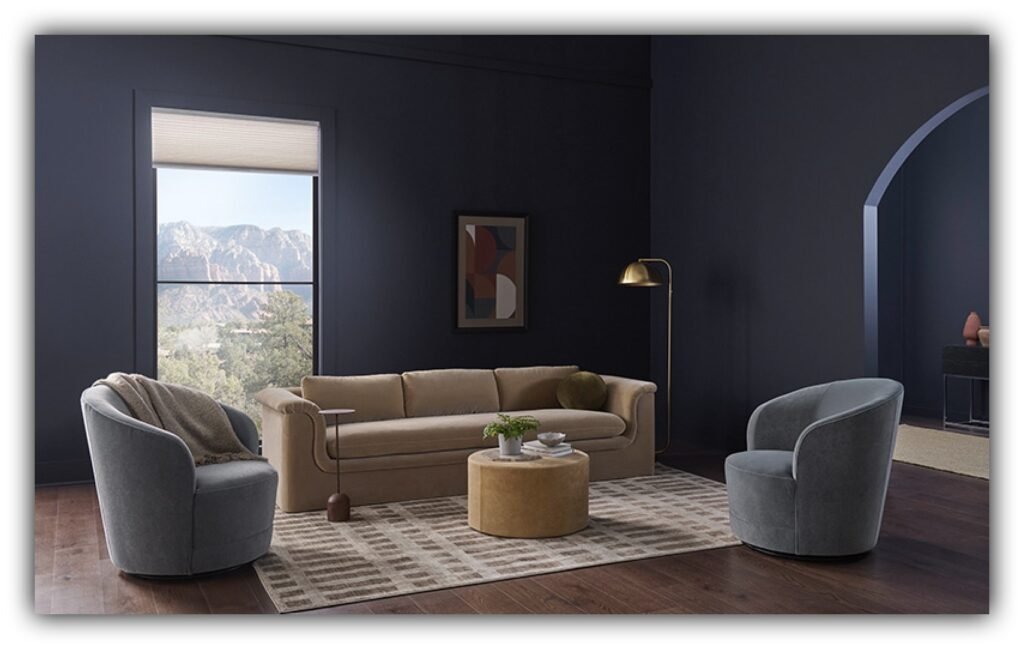
Painting walls, ceilings, and trim the same color softens the visual boundaries of a room. Without sharp transitions, your eye doesn’t immediately stop at every corner, making smaller spaces often feel larger and more cohesive.
It’s especially effective in:
- Bedrooms
- Libraries
- Home offices
- Dining rooms
- Powder rooms
Done thoughtfully, it creates warmth, intimacy, and a sense of intentional design that white ceilings sometimes interrupt.
But Like Every Trend, It’s Becoming “Trendy”
Here’s where the design world often gets ahead of itself.
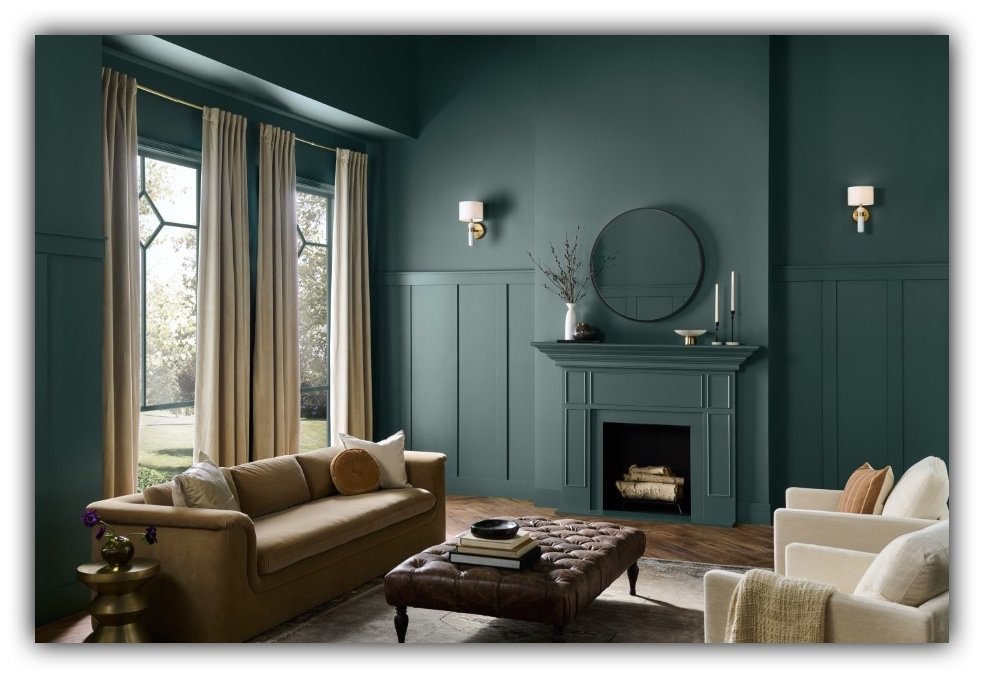
When every influencer paints their study deep olive, every powder room becomes oxblood red, and every ceiling disappears into the same moody hue, the once-fresh idea starts feeling a little predictable.
Some designers are already cautioning against treating color drenching like a formula instead of a design tool. Used everywhere, it loses some of the surprise that made it appealing in the first place.
And because the internet never leaves a trend alone, we’ve already begun hearing about “pattern drenching,” “wood drenching,” “material drenching,” and other variations that seem determined to keep the buzzword alive.
The Real Trend Isn’t Paint
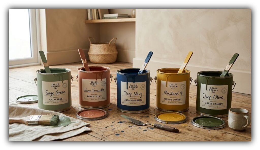
Perhaps the biggest lesson isn’t about paint at all. It’s about how quickly the design industry rebrands familiar ideas.
One decade gives us “open concept.” Then “farmhouse.” Then “hygge.” Then “Japandi.” Then “quiet luxury.” Now it’s “color drenching.”
Most are simply fresh labels attached to ideas that have existed for decades.
What’s Next?
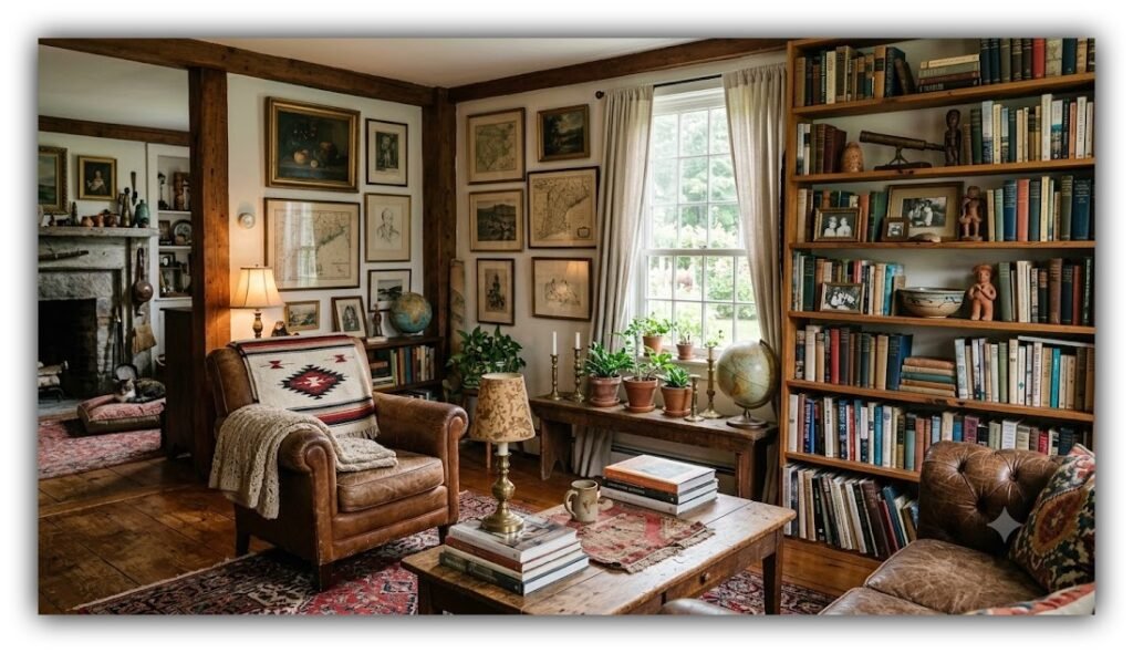
Ironically, today’s design experts are already predicting that homeowners are growing weary of rooms that look like they came straight from the same Pinterest board.
Rather than chasing the next viral aesthetic, designers say the future belongs to homes that feel personal instead of perfectly styled. Expect to see more collected interiors filled with meaningful books, vintage finds, regional influences, layered textures, and pieces that tell a story instead of following an algorithm. Even some of today’s biggest decorating trends, from overly themed styles to formulaic shelving displays, are already being called out as overdone.
That may be the most refreshing trend of all.
What do you feel about this post?

Like

Love

Happy

Haha

Sad